Now that you've successfully processed your RedEdge-P imagery—either with Metashape or with Pix4DFields—you have the essential raw materials for gaining actionable insights from your data. In this article, we guide you through helpful QGIS workflows used to put together two common multispectral deliverables: a custom raster band stack and vegetation indices.
Creating your desired band stack
Different applications require an orthomosaic with a different set of bands. You can pick and choose the bands you need and merge them into a single orthomosaic using QGIS. Two examples are shown here. The first is for those who just want a complete stack of all five multispectral bands for their orthomosaic. The second is for those who want an RGB orthomosaic that they can use to create true-color visualizations of their fields.
Building a multi-band raster
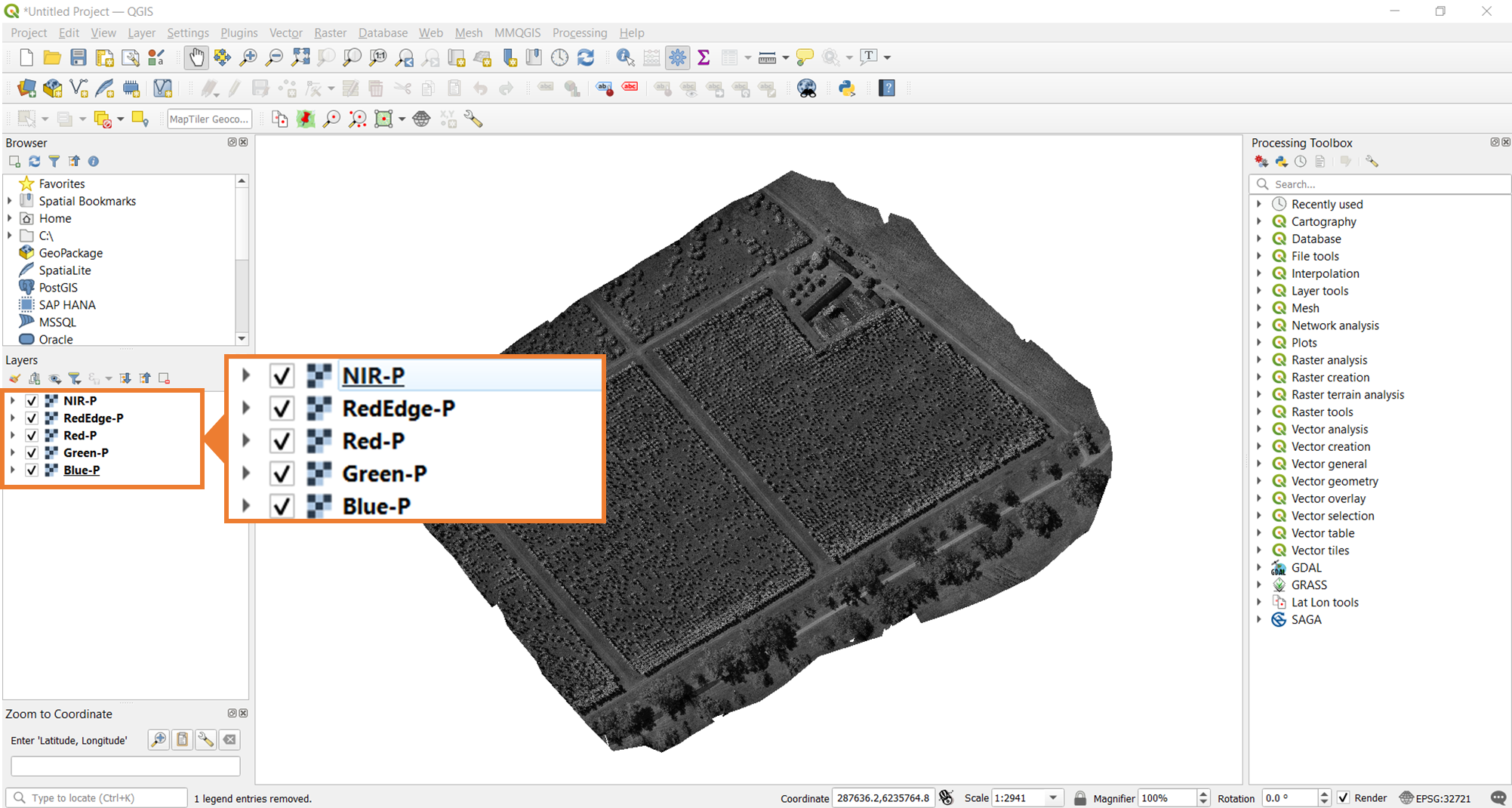
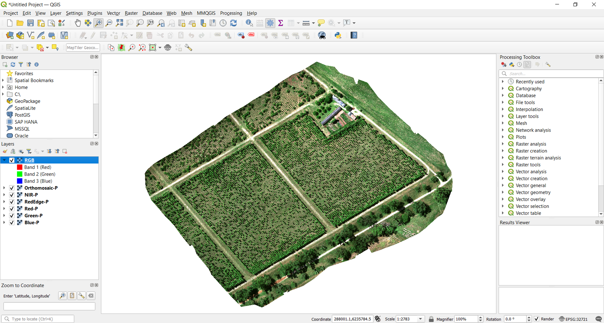
To start this process, open the five pansharpened multispectral bands in QGIS. Once you have them opened, you should be able to see all five rasters, currently visualized in grayscale as shown in the image below.
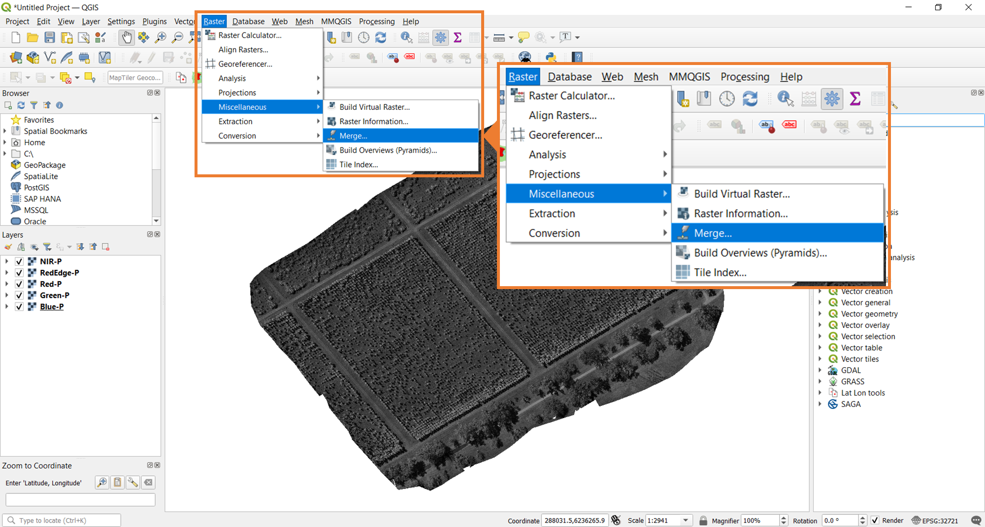
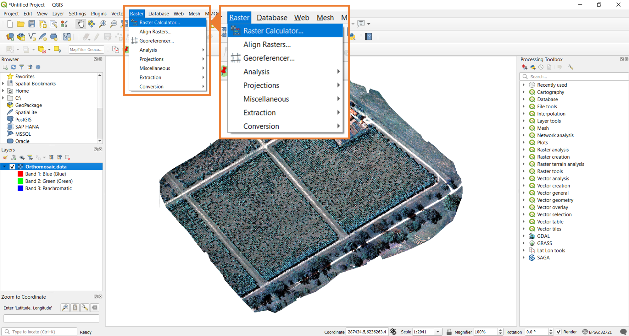
To stack the bands, the Merge tool from QGIS will be used. The image below shows where you need to navigate to find this tool.
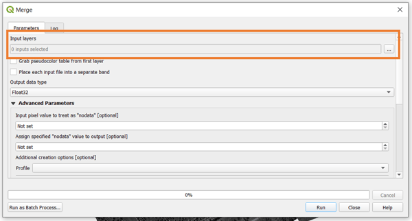
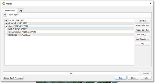
Once you click on the merge tool, a prompt will open where you set up all the parameters of the processing. To start, select the input layers.
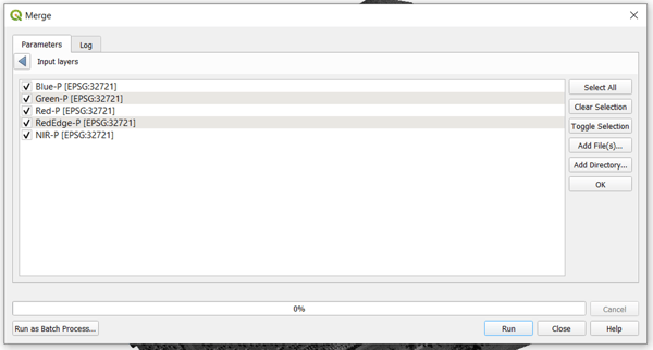
Select all the layers that you want to add to the stacked orthomosaic. Note that you can also move each of the selected layers based on the order that you want. For this example, the follow the usual multispectral ordering for Micasense rasters , which is in increasing order of spectral wavelength. Click OK to save the selection.
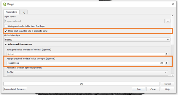
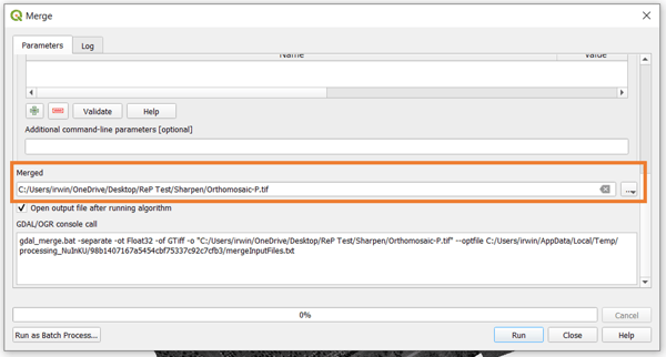
Once the bands are selected and ordered accordingly, make sure that you have the option to Place each input file into a separate band toggled. It is also good to set a value for NoData for your final raster. After this, just scroll down the window and select the output filename and location for your band stack orthomosaic, then click on Run.
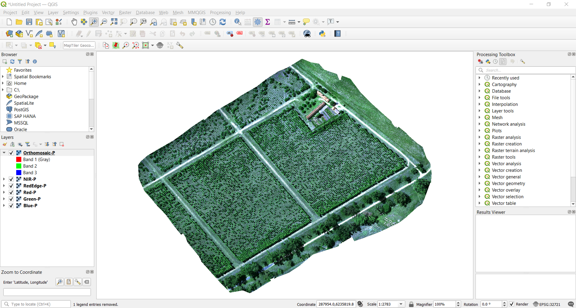
If you selected several bands, it may take a few minutes for the processing to finish. At this point, the output of the stacking should display on QGIS for you to review and inspect for quality.
Creating an RGB orthomosaic
One common band stack that is generated from multispectral imagery is an RGB visualization of the orthomosaic. To do this, you will follow the same steps. The only difference would be what bands you select and how you order them. Set it up as shown in the image below.
As you can see, only the red, green, and blue pansharpened bands are selected. They are also ordered in the way that supports the desired, resultant, orthomosaic.
Any combination of band stacks is possible using the Merge tool. In addition to the RGB true color, one common combination is the NIR false color, which uses the NIR, red, and green bands in this specific order. This is a typical output generated from multi-band satellite imagery (e.g., Landsat).
Generating vegetation indices
Multispectral data gives users insight beyond what they can ordinarily see. To help draw these insights from the data, vegetation index maps are a helpful tool. These are generated with established algebraic computations, typically ratios, of the various available multispectral bands. In this section, we guide you through how these maps are created in QGIS, and we provide helpful tips on visualization as well.
Computing the vegetation index
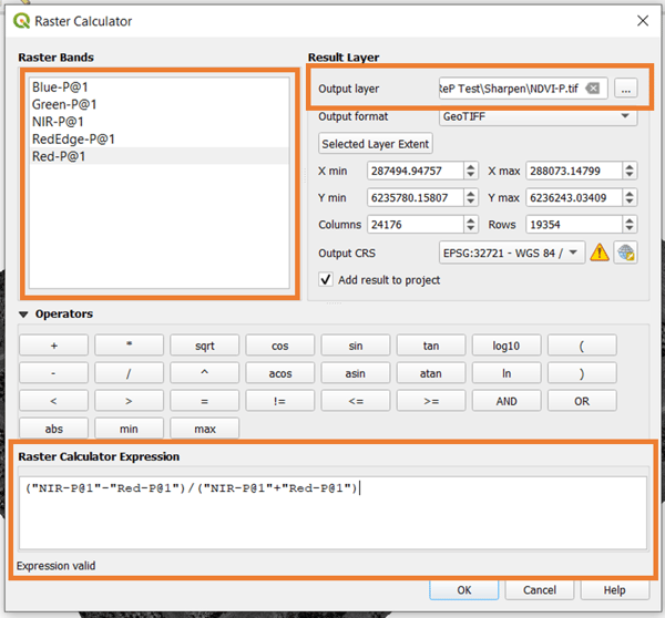
For this workflow, we create a normalized difference vegetation index (NDVI) map as an example. However, this can be adapted for other relevant indices as well. Once again, the starting point here is having all five pansharpened multispectral rasters opened in QGIS. Once these are opened, navigate to the Raster Calculator tool.
To compute a vegetation index, you need to input the expression that you want. The result is saved by designating the file location and filename (important: add ".tif" to the end).
💡 Tip: Although the NDVI is the most common vegetation index, there are many more that can be applied. Different use cases, crops, and times of the season call for a different index. Choose one that best aligns with your needs. As a starting point, check out this article on all available indices in Pix4DFields.
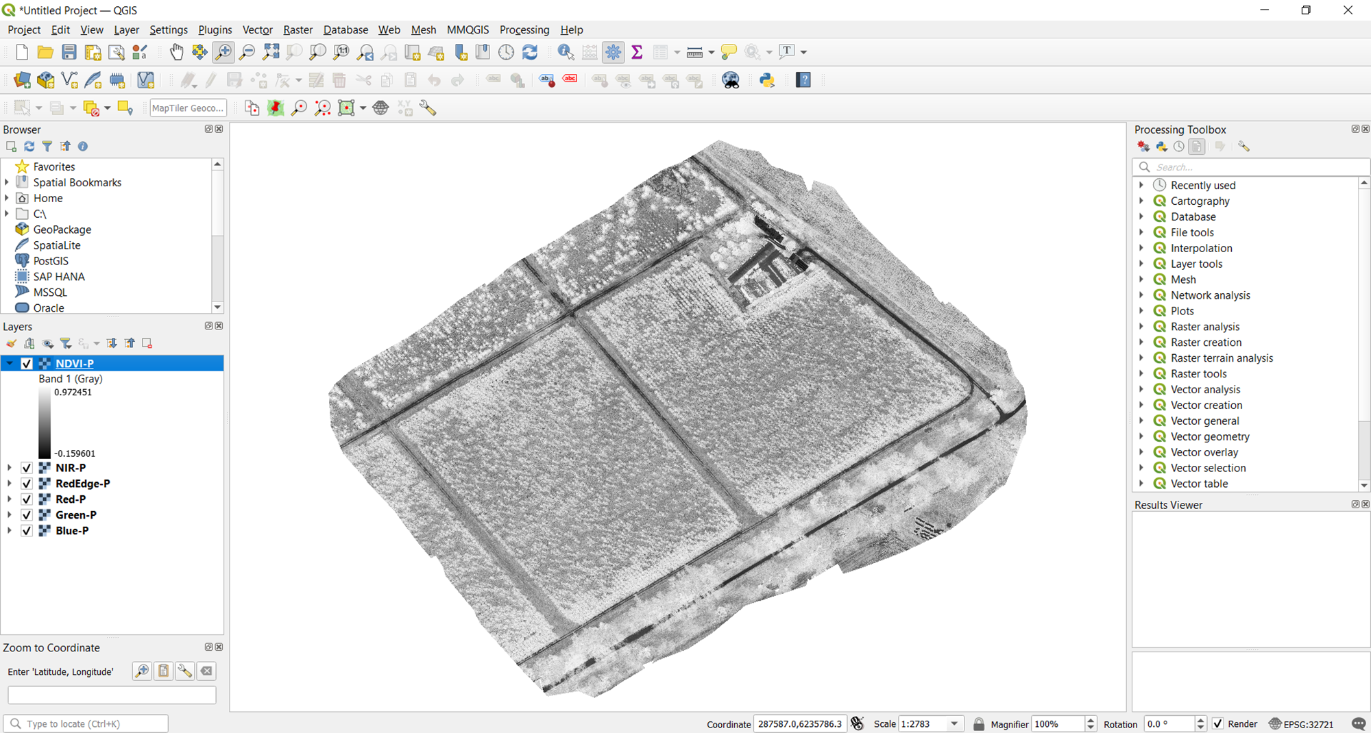
The resulting vegetation map will automatically be displayed in QGIS. By default, this is shown in grayscale. This is not the most intuitive way of visualizing the data and gleaning relevant information from it. In the next section, we share tips on how to improve visualization in QGIS.
Tips on visualizing the vegetation index map
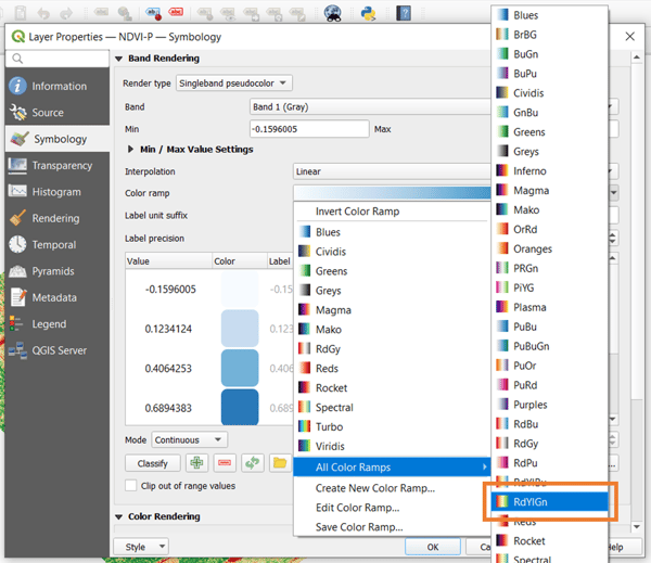
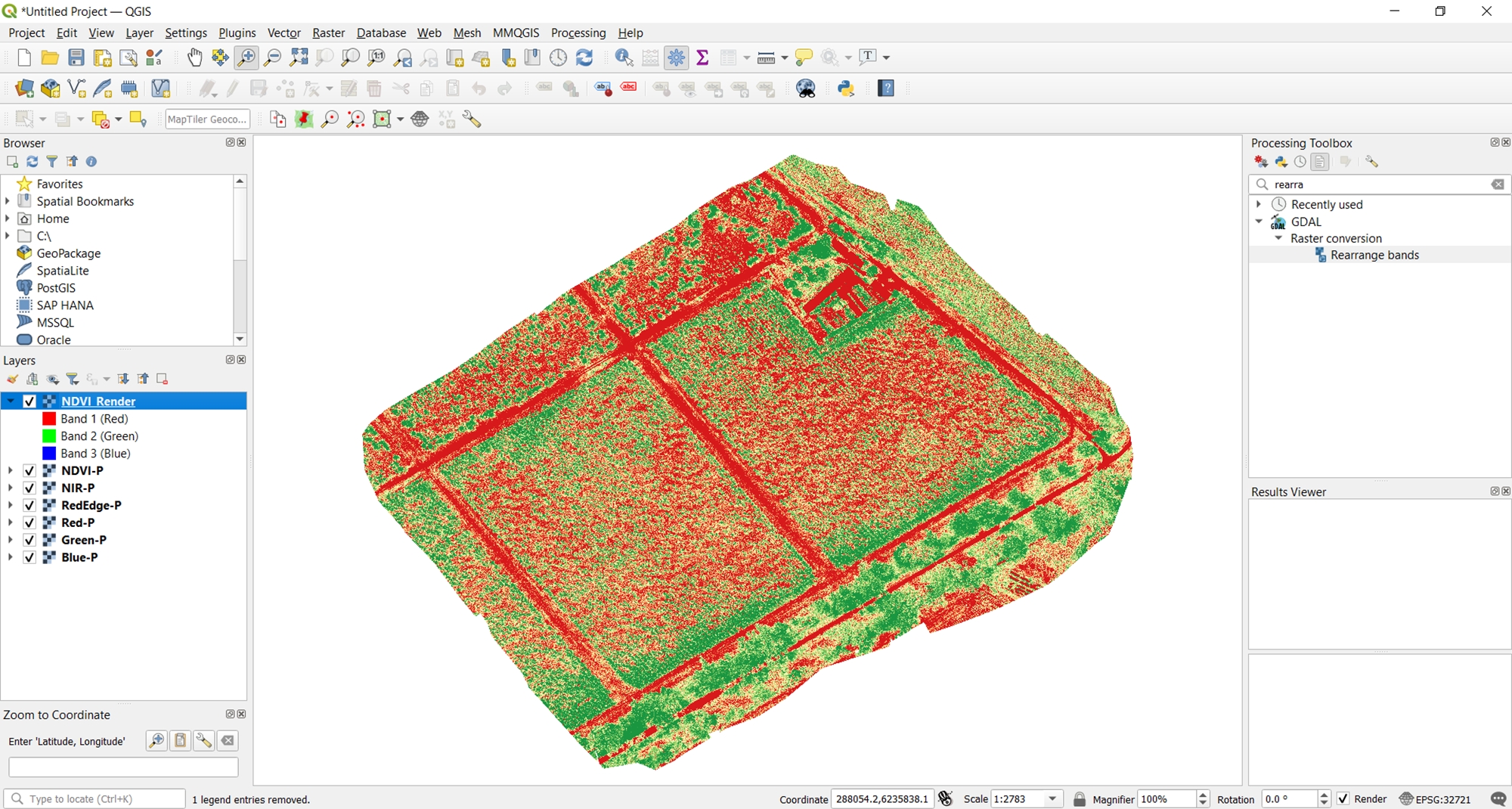
Fortunately, QGIS handles more than grayscale. With it, you can leverage other options to create a better vegetation index map. To access them, right-click on the NDVI map from the layers pane, go to Properties, and head to the Symbology tab. The default Render type is set to singleband gray. Change this to singleband pseudocolor instead.

There are a number of color ramp options you can choose from. For vegetation, the most helpful would be the RdYlGn ramp. As the name implies this ramp goes from red, yellow, then green depending on the value of the index. After choosing the color ramp, click OK to apply the visualization.
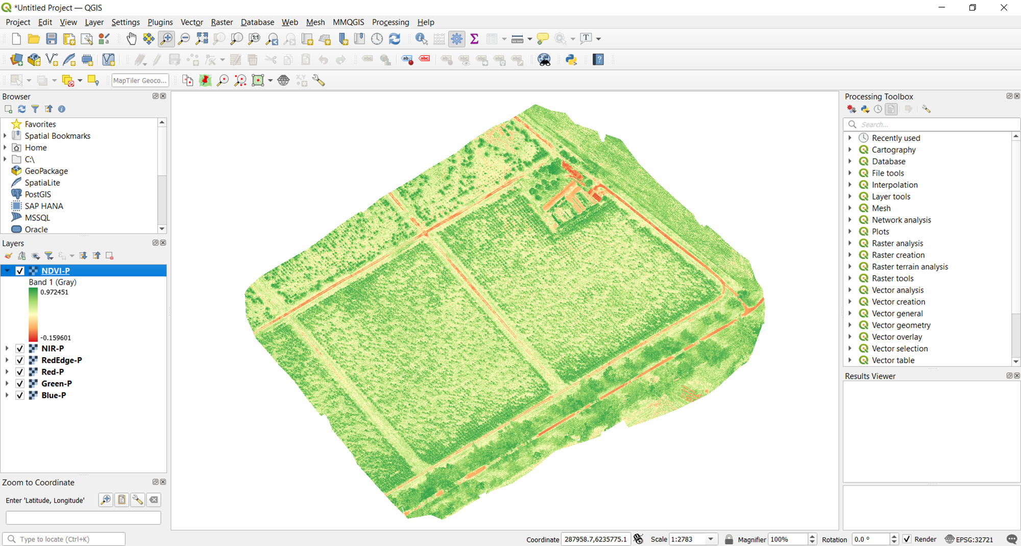
One observation can be made at this point: the current vegetation map is rather washed out. So it can't help you effectively see levels of vegetation, which is what you want. This is because the bounds of the visualization runs from the minimum value to the maximum value of the raster. You need a narrower range for a more delineated map.
To know what minimum and maximum values to set, you can consult the histogram of the raster. This shows the frequency of each data value in the raster. To inspect the histogram of your vegetation index, right-click on the layer, go to Properties, and choose the Histogram tab. The histogram will not be immediately available. To display it, click the Compute Histogram button.
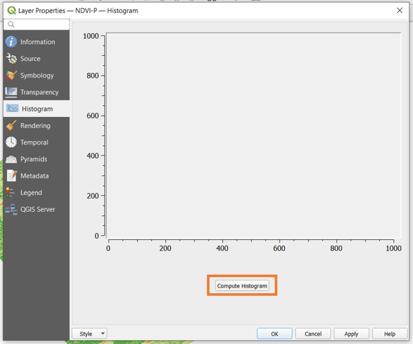
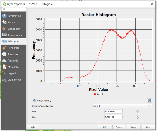
A histogram can have one or more peaks representing the pixel value that occurs most frequently across the raster. In this example, you will notice that there are two peaks a little above 0.5 and a little below 0.8. To narrow down the visualization, you can choose these two as the bounds. To do this, go back to the Symbology tab and set the minimum and maximum there. Click OK to apply.
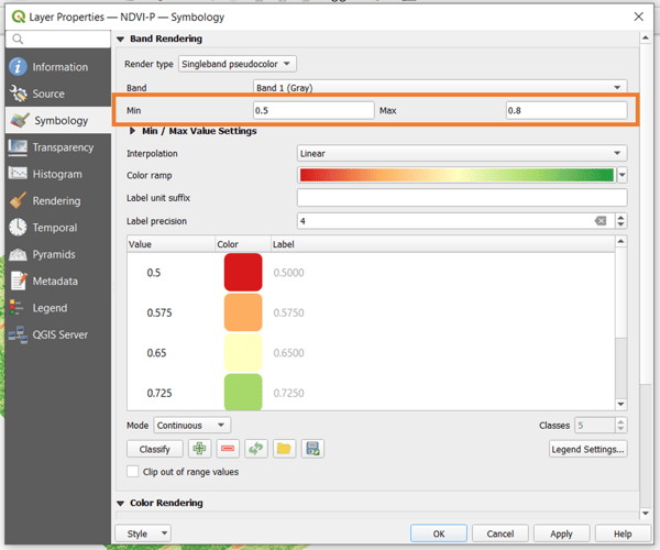
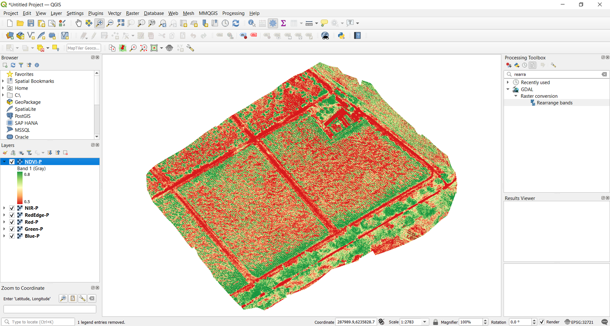
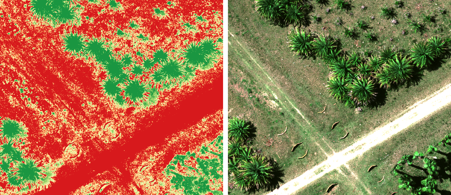
Now you have a better visualization of the vegetation index. So, you can see a clearer difference between the actual crops and the soil of the area of interest. Using the histogram method, you can play around with the bounds to find the visualization that best works for you.
💡 Tip: While changing the minimum and maximum values of the color ramp, it will help to zoom into the map and open an RGB visualization of the field. Check whether the current index visualization accurately aligns with how the vegetation is distributed and displayed in the RGB image.
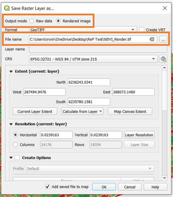
The final step here is to save the output. To do this, right-click on the layer again and select Save as.
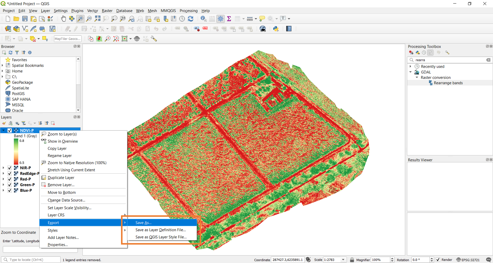
Doing so will open the prompt below. The main consideration here is the Output mode. Since you already saved the raw data during the raster calculation done above, save the Rendered image. Rendering essentially takes a snapshot of the current visualization of the vegetation index and saves it for further use. Don't forget to set the filename (with ".tif") and location as well.
You now have both the raw data of your vegetation index and the rendered image of the desired visualization. If you want to change the visualization in the future, just reopen the data raster of the vegetation index in QGIS and follow the steps above to alter how you want the map to look.
The image comparison shown below is a zoomed-in snapshot of the NDVI visualization compared to the RGB true color. Notice how clearly the vegetation is rendered by the RedEdge-P sensor.